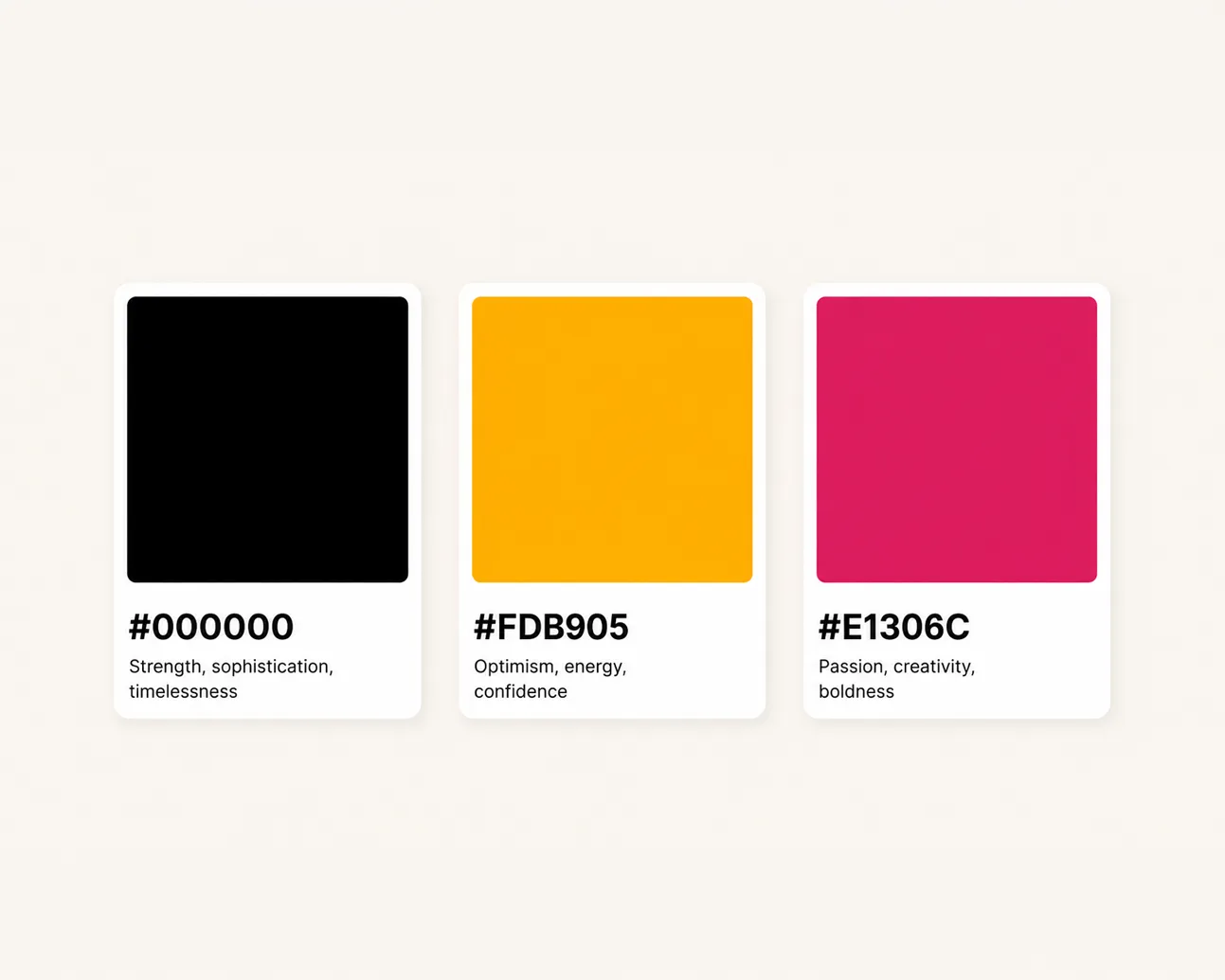
Colour Palette

Colour Palette

Colour palette design for businesses that need a stronger and more consistent visual style. We create colour systems that support your brand personality, improve recognition and make your design assets feel more connected.

Colour palette design for businesses that need a stronger and more consistent visual style. We create colour systems that support your brand personality, improve recognition and make your design assets feel more connected.

Branding

Core Colours, Support Colours, Digital Use, Print Use, Palette Guidance

Best for

Businesses that have inconsistent colours or need a clearer visual system.

Timeline

2 to 6 weeks

Phone screen with app icons representing brand communication
Branding work reviewed on a laptop and phone

[

The outcome

]

Colour choices with a clear role to play.

Colour choices with a clear role to play.

Colour has a big effect on how a brand feels, but it needs to be more than a set of shades that look nice together. A useful palette should support recognition, readability, emotion and practical day to day design.

Colour has a big effect on how a brand feels, but it needs to be more than a set of shades that look nice together. A useful palette should support recognition, readability, emotion and practical day to day design.

We create colour palettes with real usage in mind, looking at websites, social media, print, accessibility, backgrounds, calls to action and the balance between primary colours and supporting tones.

We create colour palettes with real usage in mind, looking at websites, social media, print, accessibility, backgrounds, calls to action and the balance between primary colours and supporting tones.

[

Service offerings

]

Branding that gives your business a clearer voice.

A stronger brand makes every touchpoint easier to understand. It gives your website, content, proposals and campaigns a clearer base to work from, so your business feels more consistent wherever people find you.

A stronger brand makes every touchpoint easier to understand. It gives your website, content, proposals and campaigns a clearer base to work from, so your business feels more consistent wherever people find you.

01

Core Colours

01

Core Colours

01

Core Colours

02

Support Colours

02

Support Colours

02

Support Colours

03

Digital Use

03

Digital Use

03

Digital Use

04

Print Use

04

Print Use

04

Print Use

05

Palette Guidance

05

Palette Guidance

05

Palette Guidance

[

START A PROJECT

]

Let’s talk about what you need.

Tell us about your business and the kind of brand support you need. We will come back to you with a clear plan.

Tell us about your business and the kind of brand support you need. We will come back to you with a clear plan.

[

Key benefits

]

Why businesses choose this service.

Why businesses choose this service.

Clearer style

A defined palette gives the brand a more consistent look.

Better recognition

Repeated colour use makes the brand easier to remember.

More control

Usage guidance helps your team avoid random colour choices.

Practical design

A useful palette supports digital, print and content needs.

[

The outcome

]

A palette that makes your brand easier to manage.

A palette that makes your brand easier to manage.

The final colour system should make your brand feel more consistent and easier to recognise. It should give your team enough flexibility without creating confusion.

The final colour system should make your brand feel more consistent and easier to recognise. It should give your team enough flexibility without creating confusion.

You leave with clearer colour choices and practical guidance for applying them across your website, social content, print materials and future campaigns.

You leave with clearer colour choices and practical guidance for applying them across your website, social content, print materials and future campaigns.

[

Our process

]

A simple, proven way of working.

A simple, proven way of working.

01

Step

Review

We look at your current colours, brand style and where the palette needs to be used.

02

Step

Explore

We test colour routes that match your audience, tone and visual direction.

03

Step

Refine

We shape the palette into clear primary and supporting roles.

04

Step

Guide

We provide practical guidance so the colours can be used consistently.

[

WHAT TO KNOW

]

Your questions answered.

Everything you need to know about our services, how we work and how we can support your business.

Everything you need to know about our services, how we work and how we can support your business.

Why does a brand need a colour palette?

Can you improve our existing colours?

Will the colours work on a website?

Do you consider accessibility?

Can you include print colours?

Can this be part of a wider branding project?

Let’s talk about what you need.

Let’s talk about what you need.

Tell us what you are building, changing or launching and we will help shape the right branding support around your goals.


Create a free website with Framer, the website builder loved by startups, designers and agencies.