[
BLOG
]

A documented brand identity system is not a design luxury. It is an operational asset, and the businesses that treat it as one tend to produce more consistent, more efficient, and more commercially effective marketing over time than those that treat brand as a one time creative exercise. The distinction is worth understanding clearly, because the upfront investment in a proper brand identity system pays back in ways that are not always visible in the immediate term but accumulate significantly over months and years.
The useful detail here is not only how the brand looks. It is whether the identity, wording and design system make the business easier to recognise and easier to choose. That is how we approach our brand identity service, and it is visible in our work with Atlas Surveying.
The most common approach to brand identity for small and growing businesses is to commission a logo, apply it across the most visible touchpoints, and then make visual and verbal decisions ad hoc as needs arise. The result over time is a brand that looks subtly different across different contexts: the website, the social profiles, the printed materials, the email signatures, the presentation decks. Each individual item may look reasonable in isolation. Together they create an impression of a business that has not quite made its mind up about what it is, which is a softer signal of credibility than most business owners realise.
What a Brand Identity System Actually Contains
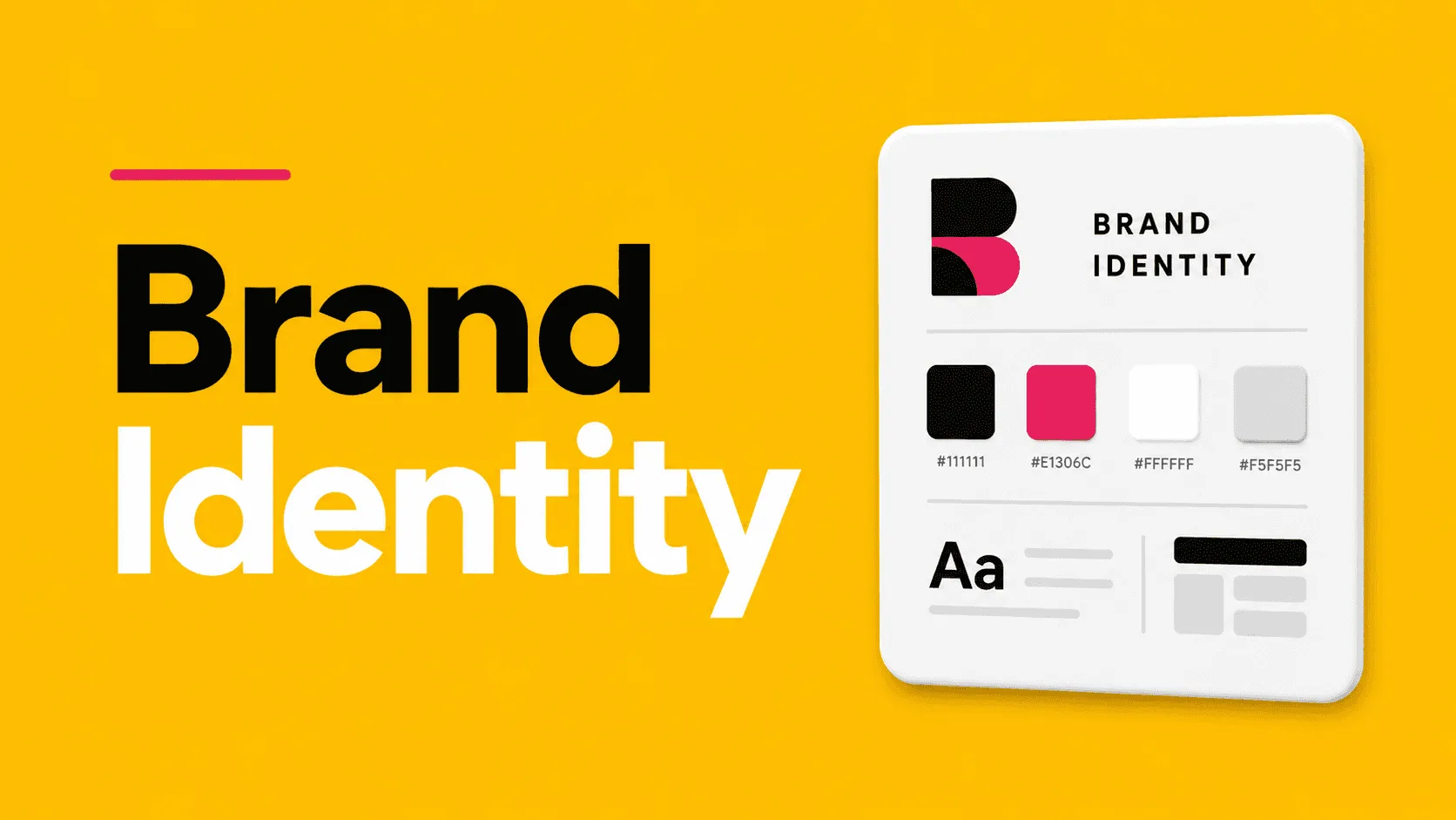
A proper brand identity system goes considerably beyond a logo. It includes a defined colour palette, with the specific values of each colour so that they can be applied precisely across print and digital without drift. It includes a typography system: the specific typefaces used for headings, body copy, and any specialised uses, and the rules for how they are sized and combined. It includes guidance on imagery: the style of photography or illustration that fits the brand and what does not. And it includes verbal identity guidance: the tone of voice, the language the brand uses and deliberately does not use, and the core messages that should be consistent across all communications.
Pro Project Promotions came to us with a name and a concept, nothing else. We built the entire brand identity from scratch for their boxing and charity events business, and that identity then carried through into the website, the ads and every piece of event material they produced. Getting it right at the beginning meant everything that followed felt deliberate.
This documentation is not the end product. It is the system that makes consistent application possible at scale. When a new employee produces their first piece of marketing content, or when an external designer is briefed on a new project, or when the business wants to assess whether a new piece of creative is consistent with its brand, the system provides the reference point. Without it, consistency depends entirely on institutional memory and individual judgment, which are unreliable at scale and non existent when new people join.
Consistency as a Commercial Multiplier
The commercial case for brand consistency is well established. Repeated consistent exposure to a brand identity builds recognition, and recognition builds trust. The business that looks the same every time a potential customer encounters it, whether on social media, in a search result, on a printed flyer, or on a proposal document, accumulates a level of perceived credibility that the inconsistent business does not, all else being equal.
This matters more in competitive markets and longer consideration cycles. A customer who is choosing between two professional services firms with comparable capabilities and pricing will be influenced, consciously or not, by the relative coherence and professionalism of each brand. The firm with a consistent, confident visual identity communicates that it is organised, attentive to detail, and established. These associations are not trivial. They influence decisions in contexts where rational criteria do not clearly differentiate the options.
The Efficiency Argument
There is a less obvious but equally compelling argument for brand identity systems based on operational efficiency. When everyone producing content for the business is working from a clear system, decisions are faster and revisions are fewer. The question of which colour to use, which font size to use, what the tone of the copy should be, these are not decisions that need to be made from scratch each time. They are answered by the system, which frees up creative and management time for questions that are genuinely new.
Businesses without a brand system spend significant time in review cycles arguing about whether something looks right, resolving inconsistencies, and briefing external suppliers who have to intuit what the brand is from examples rather than working from clear specifications. The cost of this inefficiency is mostly invisible because it is distributed across many small decisions, but it is real and it accumulates over the course of a year into a significant expenditure of time and money that a documented system would prevent.
For businesses that are at the point of investing in brand identity, or considering whether an existing brand deserves a more systematic treatment, it is worth understanding what a professionally developed brand identity covers and why the system documentation is as important as the creative output. The logos and colour palettes and typefaces are the deliverables. The system that governs how they are applied is the asset.
If your brand needs to feel clearer and more consistent, start with our brand identity service and brand guidelines service. Relevant examples include our work with Atlas Surveying and Pro Project Promotions.
[
GET INFORMED
]
Our blog is a hub for insights, tips, and industry trends in digital marketing and social media.